The visualization techniques vary from simple line graphs and histograms to complex diagrams like Sankey and network graphs.
- Graphs can be animated or made interactive for a more engaging exploration process.
- Interactive visualizations not only ease analysis but also add an element of enjoyment to the exploration.
- Tabulation, clustering, and other modeling techniques can also be a part of exploratory analysis. Even building simple models can be a part of this step.
1. Simple Graphs
Composing composite graphs from simpler ones can get even more insight into the data.
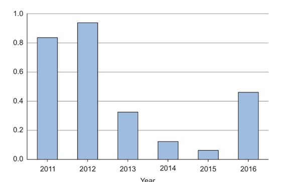
a) Bar chart
b) Line chart

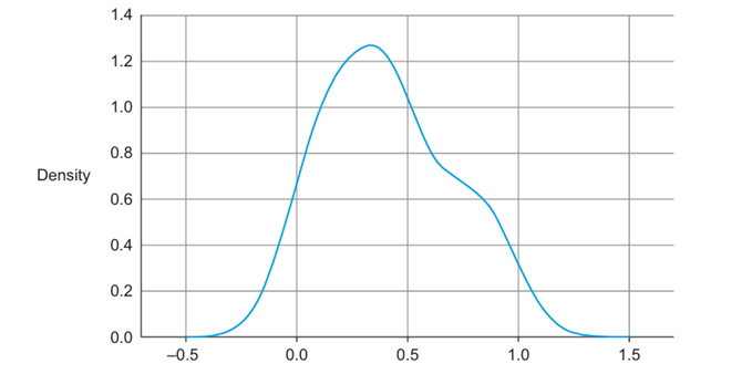
c) Distribution chart
2. Combined graph
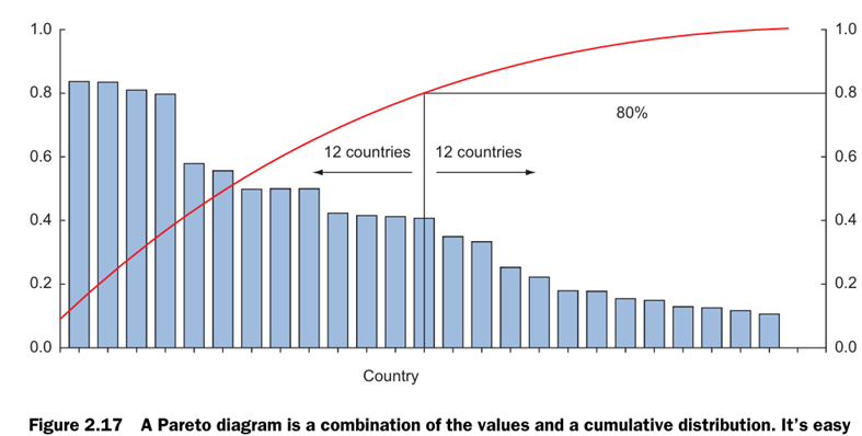
Overlaying several plots is common practice. We can combine simple graphs into a Pareto diagram, or 80-20 diagram.
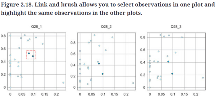
3. Brushing and linking.
With brushing and linking you combine and link different graphs and tables (or views) so changes in one graph are automatically transferred to the other graphs.
Histogram
In a histogram a variable is cut into discrete categories and the number of occurrences in each category are summed up and shown in the graph.

Boxplot
The boxplot, on the other hand, doesn’t show how many observations are present but does offer an impression of the distribution within categories. It can show the maximum, minimum, median, and other characterizing measures at the same time.

